
IELTS Writing Task 1
You must write a minimum of 150 words in response to a specific graph (bar, line, or pie graph), table, chart, or procedure (how something works, how to accomplish something) for the first writing activity on the IELTS. One examiner assesses your writing task performance by asking you to identify and summarize the key aspects of the provided graph. To characterize and compare the data, it is therefore required to pinpoint the key elements and patterns in factual information. No matter how proficient you are in English, you must still acquire some IELTS writing techniques before beginning a work. Here, in the section provided below,
IELTS Example Responses for Writing Task 1
1. The amount of money spent and received in a year by an American children's charity is displayed in a pie chart.
Provide a summary of the material by highlighting and summarizing its key points, along with any pertinent analogies. Compose a minimum of 150 words.
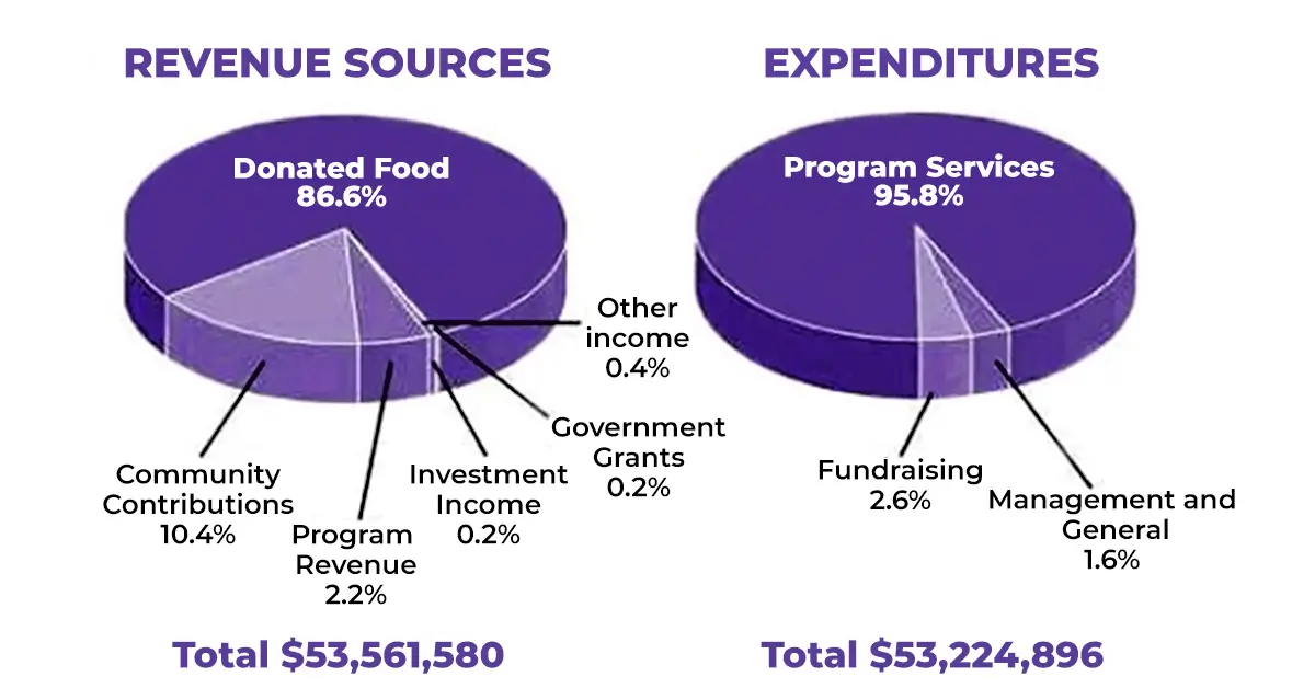
The pie charts show the amount of revenue and expenditures in 2016 for a
children’s charity in the USA. Calibration of data is done in percentage.
Overall, the total amount of income was just enough to cover the expenditures.
Moreover, donated food made the highest share of total income while the maximum
money was spent on program service.
To begin with, donated food provided the most of the revenue for the charity, at
86%. Similarly, with regard to expenditures, program services, were calculated
for nearly all of the outgoings, at 95.8%. The other categories were much
smaller. Community contributions were the second largest revenue source,
bringing in 10.4% of overall income, and this was followed by program revenue,
at 2.2%. on the other hand, investment income, government grants, and other
income were very small sources of revenue, accounting for only 0.8% combined.
There were only two other expenditure items, fundraising and management, and
general, with a slight difference accounting for 2.6% and 1.6% respectively.
NOTE: In your IELTS writing task 1 solution every time, while doing any
form of a graph, practice picking out major changes and common trends.
2. The two pie charts below show the online shopping sales for retail sectors in Canada in 2005 and 2010.
Summarise the information by selecting and reporting the main features, and make comparisons where relevant.
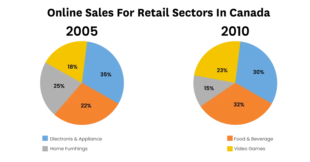
The two pie charts compare the percentages of online sales across
different retail sectors in Canada in two different years, 2005 and
2010.
Overall, the online sales of electronic items and home furnishing
dropped, however, the craze for food and video games increased during
the five years.
To begin with, in 2005, the majority of online sales accounted for the
electronics and appliance sector at 35%, however, this percentage had
dropped to 30% by 2010. During the same five-year period, the number of
people deciding to buy food and beverages online increased and the
transactions went from just 22% to 32%, making it the retail sector with
the largest proportion of the online market.
In 2005, the home furnishing industry boasted an impressive 25% of the
total online sales in Canada. However, by 2010, the figure had fallen
considerably to 15%. Interestingly, online sales of video games
eventually overtook sales of home furnishing, although video games still
represented only 23% of the market.
NOTE: In IELTS writing task 1 question answers don’t draw an overview
that does not support the information or is different from your
explanation.
3. The given pie charts compare the expenses in 7 different categories in 1966 and 1996 by American Citizens.
Summarise the information by selecting and reporting the main features, and make comparisons where relevant.
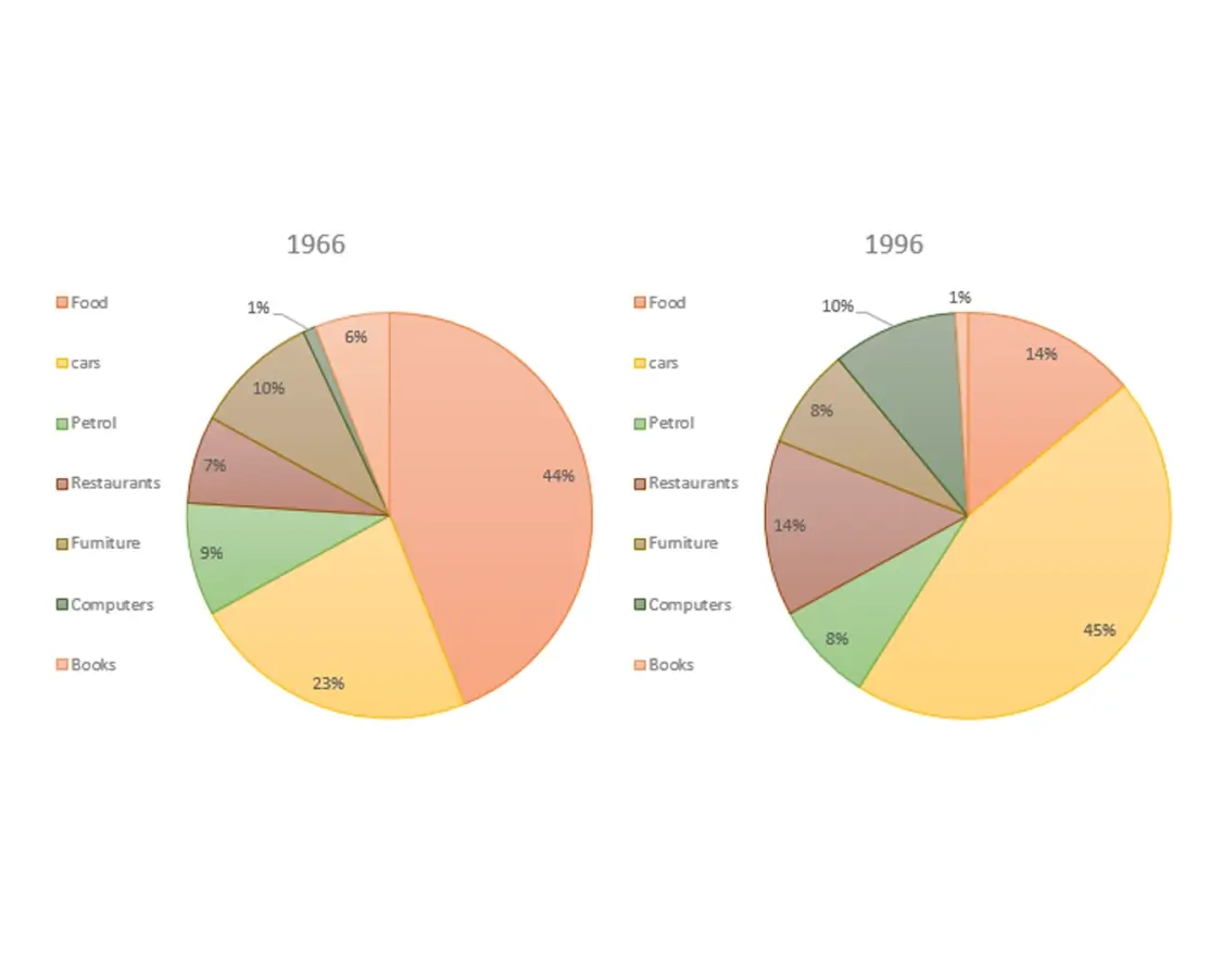
The two pie charts compare the expenses of US residents in two different
years in seven categories from 1966 to 1996. The data is calibrated in
percentage.
Overall, expenses on cars, restaurants, and computers revealed a
positive trend, however, expenses on remaining items showed a decrease
in a given period.
It is clear that the largest ratio of American citizens' spending went
on food and cars. On the other hand, computers and books had the lowest
percentage in the chart in 1966 and 1996 respectively. However, the
percentage for cars rose to nearly double at 45% in 1996. Whereas, the
proportion of spending on food fell from 44% in 1966 to only 14% in
1996.
The drastic change was seen for computers it stood at only one percent
in 1966 but reached 10% in 1996. There was a two-fold increase in
restaurant spending by American citizens, from 7% in 1966 to 14% in
1996. Whereas, a significant decrease was seen in book purchasing.
Surprisingly, over a period there was no marked change in the ratio of
petrol and furniture.
NOTE: Undoubtedly, for a higher score in IELTS writing task 1
you need to select main features and make comparisons where relevant.
4. The pie charts below show the average household expenditures in Japan and Malaysia in the year 2010..
Summarise the information by selecting and reporting the main features, and make comparisons where relevant.
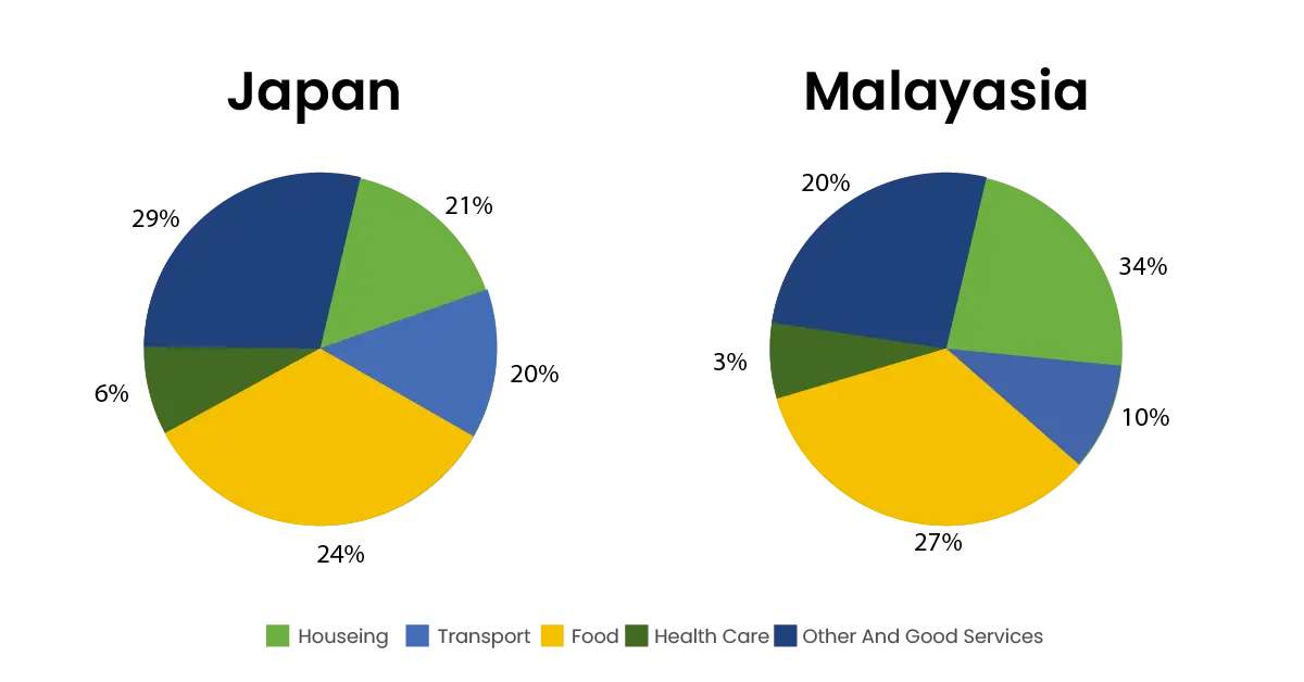
The two pie charts show the proportion of money spent on various
household necessities in Malaysia and Japan in 2010. The date is
calibrated in percentage.
Overall, the data indicate that in both cases food, housing, and other
goods and services were the main expenses while both countries spent the
least on health care.
It can be clearly seen from the chart, that in Malaysia, the greatest
proportion of expenditure (34%) was on housing, while in Japan housing
accounted for just 21% of the total. Followed by in Japan the greatest
single expense was other goods and services at 29%, compared with 26% in
Malaysia.
Moreover, food came in second place in Japan, at 24%, while in Malaysia
the actual proportion was higher (27%). In Japan, another major expense
was transport, at 20%, but this was much lower in Malaysia (10%).
Surprisingly, in both countries, the smallest percentage of expenditure
was on health care.
NOTE: The coherence and cohesion of your answer are also
assessed in writing task 1. Therefore, in IELTS writing task 1 answers
you need to organize your writing.
5. The table illustrates the proportion of monthly household income five European countries spend on food and drink, housing, clothing, and entertainment.
Summarize the information by selecting and reporting the main features and make comparisons where relevant.
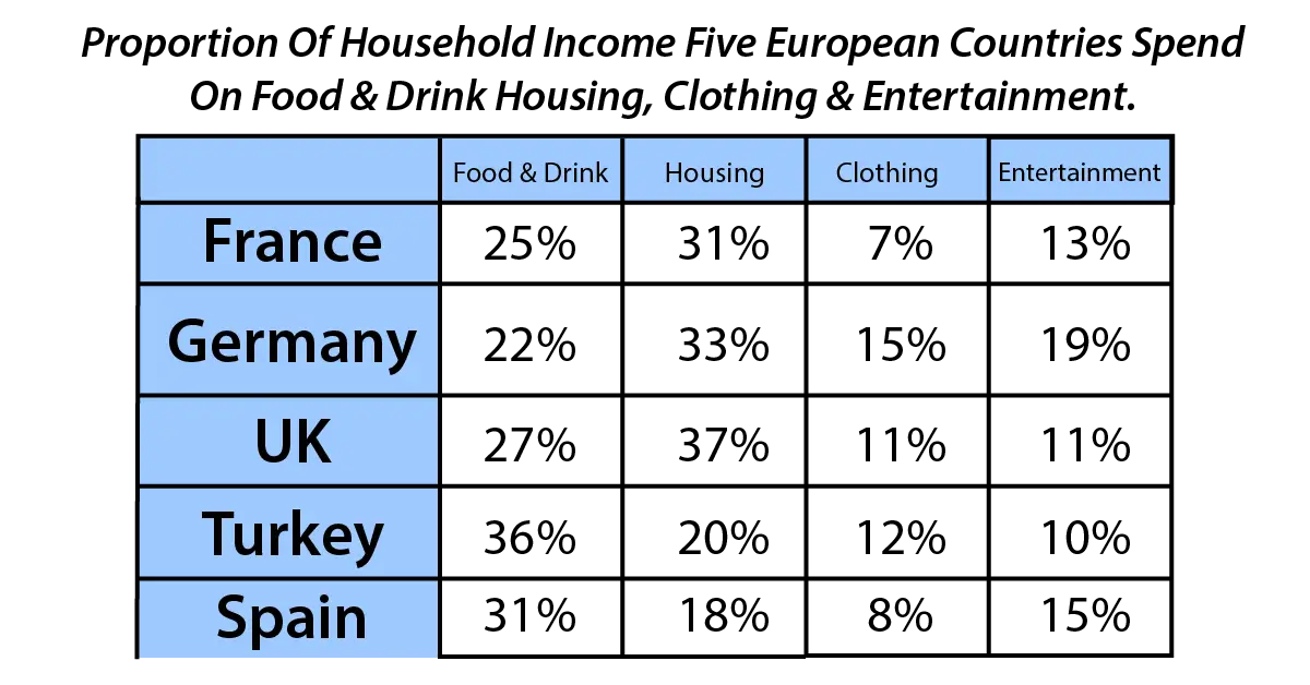
The table chart shows the amount of household income that five countries
in Europe spent per month on four items. The data has been calibrated in
percentage.
Overall, all five countries spend the majority of their income on food
drink, and housing. However, the expense was far less on clothing and
entertainment.
It is clear from the chart, that housing is the largest expenditure item
for France, Germany, and the UK, as all of them spend around one-third
of their income on this, at 30%, 33%, and 37% respectively. In contrast,
they spend around a quarter on food and drink. Surprisingly, this
pattern is exactly the opposite of Turkey and Spain, which spend a fifth
of their income on housing, but one-third on food and drink.
Furthermore, spending on clothing and entertainment are the two items
which all five countries spend much less. Regarding clothes, France and
Spain spend the least, at less than 10% on the other hand, the other
three countries spend the same amount ranging between 12% and 15%.
Germany spends one-fifth on entertainment, at 19%. Whereas, the UK and
Turkey spend approximately half of this amount.
NOTE: Use the wide range of lexical resources in IELTS writing
task 1 solutions e.g. for increase write incline, rise, climb, surge.
6. The table shows the Proportions of Pupils Attending Four Secondary School Types Between Between 2000 and 2009.
Summarize the information by selecting and reporting the main features
and make comparisons where relevant.
Write at least 150 words.
| Year | 2000 | 2005 | 2009 |
| Specialist Schools | 12% | 11% | 10% |
| Grammar Schools | 24% | 19% | 12% |
| Voluntary-controlled Schools | 52% | 38% | 20% |
| Community Schools | 12% | 32% | 58% |
7. The two pie charts show the sources of income of ANZ theatres and Heritage Trust, a government-funded organization, in the years 1980 and 2000.
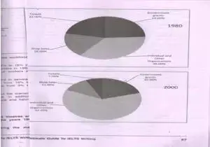
The sources of income of ANZ theatres and heritage trust are depicted by
two pie charts in the years 1980 and 2000. Calibration of data is done
in percentage.
Overall, the contribution of income from individuals and other
organizations showed an upward trend while all other remaining sources
revealed a downward trend.
It is clearly seen from the charts, that revenue from individuals and
other companies made up about one-third of its income in 1980, which
rose by two-fold in the span of 20 years. While, the contribution from
the government was nearly 25% in 1980, which fell slightly to 20% in
2000.
Moreover, the sale of shops accounted for one-fifth in 1980; however,
this ratio fell sharply to 11% in 2000. Furthermore, the last source of
income, the tickets comprised significantly less at 7% in 2000, compared
to that of 22% in 1980.
NOTE: In Both IELTS writing modules your handwriting should be legible
and clean for good scoring. Neat and clean handwriting is the key
feature to success in IELTS writing task 1.
8. The table below shows the monthly expenditure of an Australian family in 1991 and 2001.

The table shows changes in the spending patterns of an average
Australian household between 1999 and 2001. The data is calibrated in
Australian Dollars per month.
Overall, the expenditure on food, electricity, housing, and
goods/services showed more or less increase while clothing and transport
decreased.
To begin with, the amount of monthly spending on electricity and water
saw a dramatic increase over the ten-year period from $75 to $120. In
terms of the expenditure on non-essential goods and services, the rising
trend was less obvious with a minor increase of $20. At the same time,
only a five percent rise was seen in food and housing.
However, there was a decrease in expenditure on the other two items.
Australians used to spend less than a third on clothing, which fell from
$30 to $20. Similarly, the expenditure on transport dropped from $ 70 in
1991 to $ 45 in 2001.
NOTE: You are assessed for the wide range of sentence structure,
therefore, use three and four types of sentences in your IELTS writing
task 1 answers.
9. The table illustrates the breakdown of scores for the IELTS general test in 2010. The data has been calibrated in numbers.
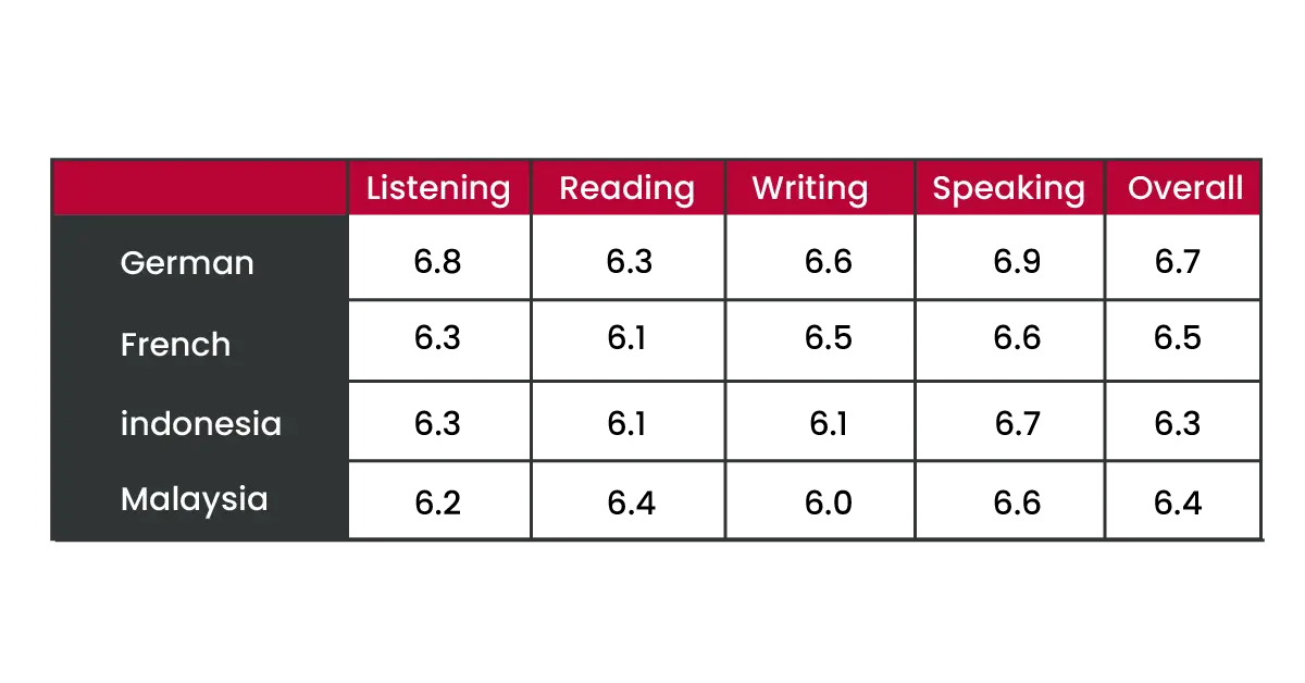
Overall, after noting the scores of each section, it is interesting to
know that on average all the students have scored the highest marks for
the speaking section and the lowest marks for the reading section.
It is clear from the chart, from an overall perspective; German speakers
achieved the highest grades with an average score of 6.7 across all four
sections. Moreover, French speakers scored the second highest scores
overall, closely followed by Malay and Indonesian speakers.
French speakers did not do as well in the reading, speaking, and
listening sections as the Indonesian and Malay speakers. There was a
significant difference in the grade of their writing section. These
grades were high relative to Indonesian and Malay candidates.
Surprisingly, Malay speakers, who achieved the second-lowest results
overall, achieved. The highest results of all four language groups for
the reading section.
NOTE: Apart from writing skills, highly developed analytical skills are
also required in IELTS as you can see in these IELTS writing task 1
sample Answers.
10. The table below shows sales made by a coffee shop in an office building on a typical weekday.
Summarise the information by selecting and reporting the main features, and make comparisons where relevant. You should write at least 150 words.
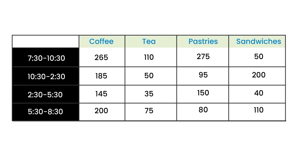
The table depicts the information about the sale of eatables and
beverages in a coffee shop on a particular weekday. Calibration of data
is done in numbers.
Overall, coffee was the most preferred drink while the sandwich was the
least preferred item.
It is clearly seen from the tabular chart, that the sale of beverages
was higher in the peak hours of the morning at 7:30 and in the evening
at 5:30. The sale of coffee was the highest with 265 cups at 7:30 and
200 at 5:30 and the same pattern was followed by tea as it was at 110
and 75 at the same time. Coffee and tea both experienced a decline at
10:30-2:30 and 2:30-5:30, Moreover, more decrease was seen in tea with
the least sales of 35 at 2:30-5:30.
In the case of pastries and sandwiches, pastries were sold to a maximum
of 275 people in the early morning. Nearly half of this was seen at 150
in 2:30-5:30. However, the sale was far less at 10:30 and 5:30 with 95
and 80 respectively. This trend was the opposite for sandwiches as more
sale was noticed at 10:30 and 5:30.
NOTE: Don’t forget to leave at least 5 minutes for revision at the end.
11. The two pie charts below show the percentages of industry sectors’ contribution to the economy of Turkey in 2000 and 2016.
Summarize the information by selecting and reporting the main features and make comparisons where relevant. You should write at least 150 words.
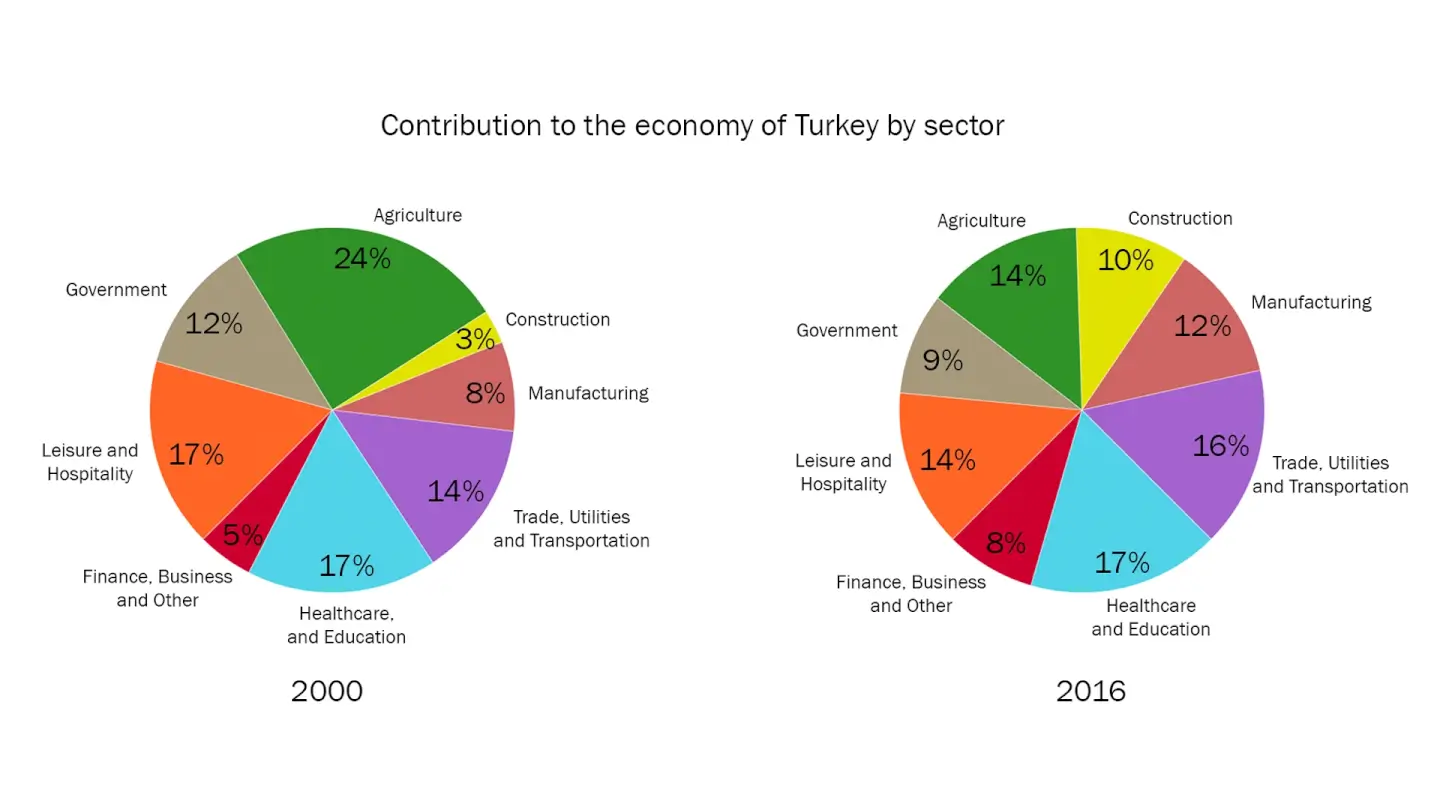
The two pie charts illustrate the contribution made by different
industrial sectors in Turkey’s economy between 2000 and 2016. The data
is calibrated in percentage. Overall, in the given period of time,
construction, manufacturing, trade, utilities, and finance, businesses
showed an upward trend, whereas agriculture, government leisure, and
hospitality depicted a downward trend in Turkey’s economy. Healthcare
and education remained the same in the given period of time. To begin
with, the construction sector comprised 3% of Turkey’s economy in 2000,
whereas by 2016, it experienced a more than threefold increase to 10%.
Economic output from trade, utilities, and transport was 14% in the
beginning year and rose slightly by 2% in 2016. In 2000, manufacturing
and finance, business, and other services made up 8% and 5% of Turkey’s
economy and then the ratio increased to 12% and 8% in 2016 respectively.
The agricultural sector accounted for almost a quarter of Turkey’s
economy in 2000, falling to 14% in 2016. In 2000, economic income from
government and leisure and hospitality both decreased by 3% after 16
years of the period. Healthcare and education, on the other hand,
remained constant in both years.
NOTE: You are suggested to spend 5 minutes analyzing task 1, which will
help you to maintain the flow of writing in your IELTS writing task 1
solution.
12. The pie charts below show the comparison of different kinds of energy production in France in two years.
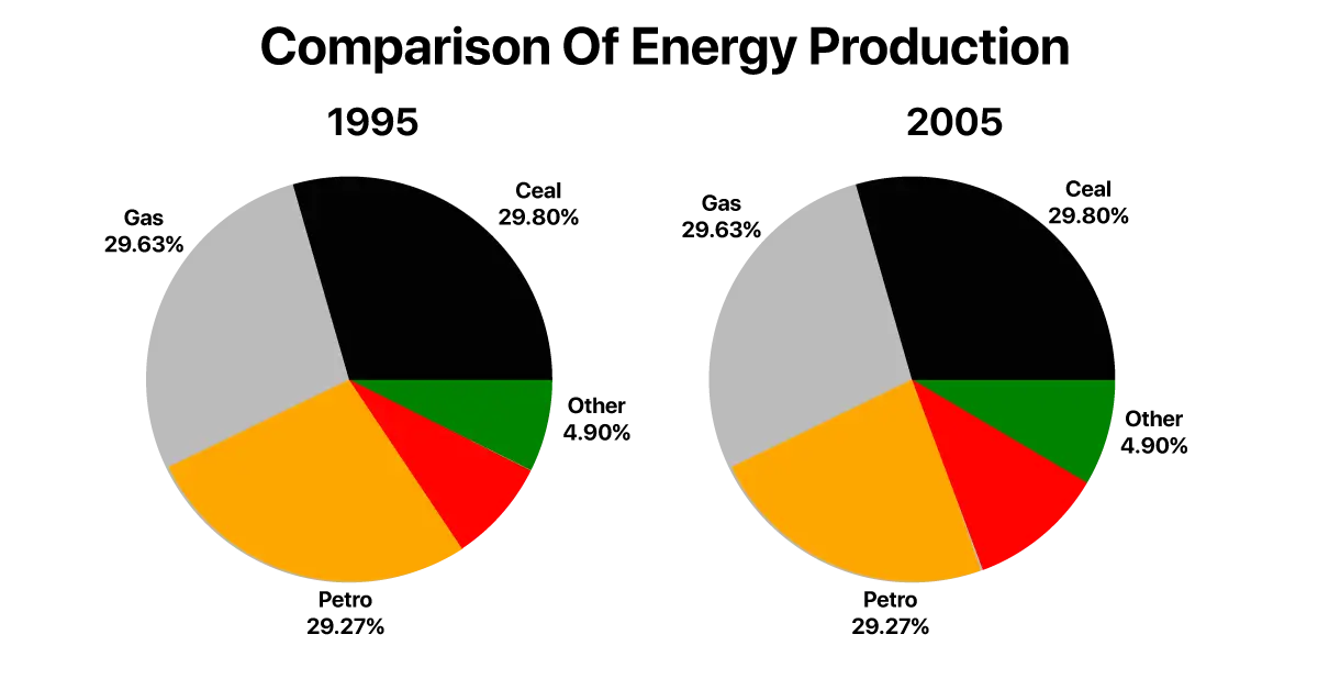
The two pie charts compare the proportion of five types of energy production by the different sources in France in 1995 and 2005. Overall, the major sources of energy were gas and coal in both years while nuclear and other kinds of energy sources generated the minimum amount of energy in France. Petrol was the only source which reduced in the last year. It is clear from the graph of the graph, in 1995, the energy produced by coal comprised 29.80% and experienced a very slight increase of about 1% in 2005. Likewise, in the first year, gas generated 29.63% which rose marginally to 30.1% in the last year. With regards to nuclear power and other sources, there was an approximate 5% increase in energy production and reached 10.10% and 9.10% respectively. On the other hand, petrol was the only source which went down from 29.27% in 1995 to 19.55% in 2005.NOTE: Be it a line, bar, pie, table, process, or picture, overall is highly achievable for a good band score in IELTS writing task 1 question answers.
13. The two pie charts below show the Death ratio through infectious diseases in Canada in two years.
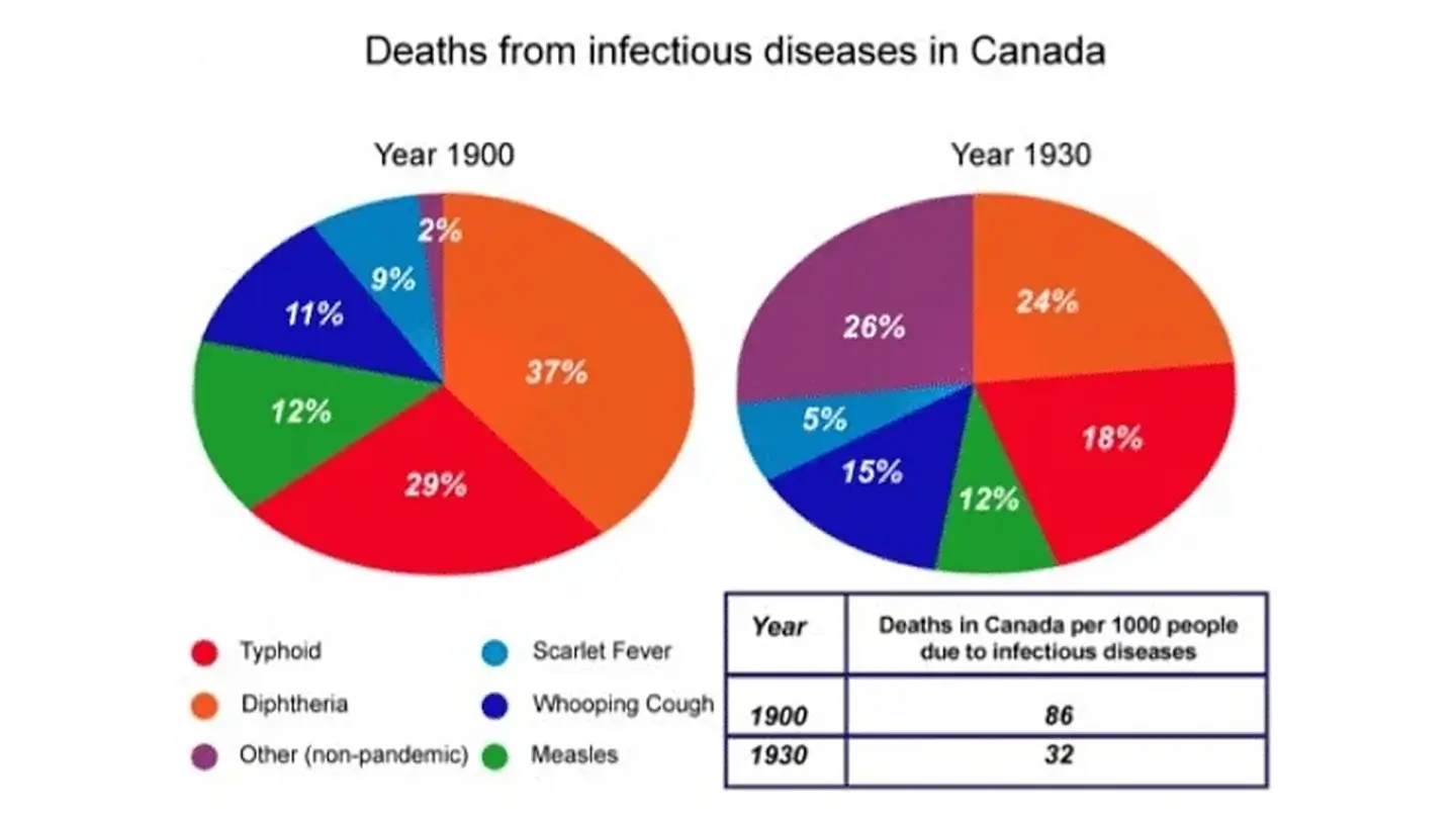
The two pie charts compare the fatality rates of infectious diseases in
Canada between 1900 and 1930. The data is calibrated in percentage and
the table chart illustrates the number of deaths due to infectious
disease per 1000 people in Canada for the same year. Overall, at the
beginning, of the year, Diphtheria was the significant reason for death,
after thirty years, non-pandemic became the major disease while
causalities by Measles remained the same over the given period. Death
rates due to infectious diseases fell dramatically over the period. It
is clear from the graph, that in 1900, deaths due to Diphtheria were at
37% which dropped to 24% in 1930. Typhoid and Scarlet fever fell from
29% to 18% and 9% to 5% respectively. On the other hand, fatality rates
due to a Whooping cough rose up from 11% to 15% and other [nonpandemic
diseases] grew 13 times more than its initial death rates over the
period of thirty years. Measles was the only disease, holding a constant
proportion of the death rate at 12%. Switching to the table chart, in
1900, 86 out of 1000 people died of infectious diseases in Canada.
However, in 1930 the death rate shrunk tremendously and reached 32.
NOTE: IELTS Writing Task 1 is report writing, therefore, there is no
space for self-assumptions.
14. The pie chart shows the electricity generated in Germany and France from all sources and renewable in the year 2009.
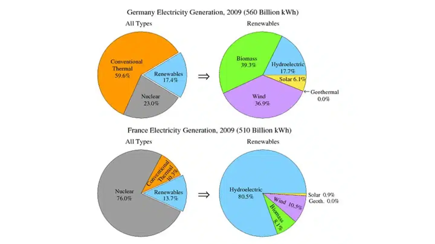
The four pie charts compare the electricity produced by two countries namely Germany and France in 2009. The data is calibrated in KHz.Overall, the total outcome of electricity production was more by renewable and other sources in Germany, than in France. In Germany, conventional thermal was the main source of electricity while nuclear was the prime factor in France. It is clear from the graph, in Germany, the total electricity made up from conventional thermal was more than half, at 59.6%, while in France, it accounted for just 10.3%, with a significant ratio of electricity coming from nuclear power at 76%. In Germany, electricity output was only one-fifth of the total. In regards to Renewable, in Germany, most of the renewable consisted of wind and biomass, in total around 75%, which was far higher than hydroelectric and solar which comprised of 17.7%and 6.1% respectively. While, in France, hydroelectric made up 80.5% of renewable electricity, and biomass, wind, and solar accounted for 8.1%, 10.5%, and 0.9% respectively.NOTE: As it is report writing, your language must be formal (Check some writing task 1 Sample Answers for guidance).
15. The pie graphs below show the result of a survey of children’s activities. The first graph shows the cultural and leisure activities that boys participate in, whereas the second graph shows the activities in which the girls participate.
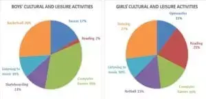
The two pie charts compare the survey results of boys' and girls'
participation in various free time and cultural activities. The data is
calibrated in percentage. Overall, most of the boys are highly inclined
towards games while a significant ratio of girls opted for dancing. It
is noticeable from the graph, that just more than one-third of boys
played computer games while 2.6% preferred playing Basketball.
Furthermore, more than one-tenth of them liked Skateboarding and Soccer
was preferred by 17% of boys. A very low proportion of boys opted to
read books, at 2%. Surprisingly, listening to music was an activity
which was equally enjoyed by boys and girls, at 10%. Switching to girls'
activities, the most popular interest among girls was dancing at 27% and
reading at 21%, unlike boys. 11% and 15% preferred gymnastics, and
netball. Interestingly, playing computer games was not much famous among
girls as compared to boys.NOTE: There is a certain sentence structure
that should be practiced for an exam in writing your IELTS writing task
1 answers.
So these are some IELTS writing task 1 sample answers for you. You can
practice it and implement these Ideas in your regular practice and you
will assuredly get a positive change in your IELTS results.
